A common misconception is that the beauty in visualisations comes from clever uses of colours, shapes and layouts. All are incredibly important things to consider for a piece to communicate efficiently, but without a solid foundation of really fantastic data a visualisation will always fail in my eyes. I dread having to visualise small tidbits data provided by clients as there is seldom any advantage in doing so and no opportunity to enhance the readers understanding.
That is why working on my latest project was such a pleasure.
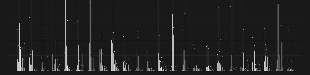
The Eurovision Song Contest is an annual televised competition between European countries who each get to perform and vote for their ‘favorite.’ It’s well known that blocks of countries regularly exchange big points year on year to the same countries, although they would no doubt argue that is a result of sharing similar musical tastes. The most famous example is Greece and Cyprus who have awarded each other maximum points on every occasion in the past 15 years. Once I started digging through the voting tables I begin to uncover other startling consistencies, and once visualised a whole lot more began to emerge.
 |
| >Click here to enlarge |
The final result highlights these voting trends even more clearly than I dared hope and shows off the real potential of visualising data. Whereas before we would need to intensively study and compare tables of numbers, the patterns now jump out and are impossible to ignore. I must admit I am quite excited for the 2012 contest next weekend (26 May). Not because of the singing of course, I will be following the voting and predicting who that elusive twelve points will be going to.
To see this and more of my work visit my website by clicking here:
lifeindata.site50.net