Friday, 27 April 2012

Visualising Data Day


I first became aware of Andy Kirk's visualising data workshops while studying for my MA last year, however pressures on time meant I never got around to attending. Having now earned my degree, found a job and with holidays to take I decided to visit a London event to help fill in some of the gaps in my knowledge. As these events are intended as an introduction to the subject I was conscious that we would be covering a lot of ground which I was already familiar with, however I was also keen to get an opportunity to discuss visualisation with others who have an interest in this field, something I have sorely missed since graduating from uni.

Many of the subjects covered in the early sections were indeed quite familiar to me, in fact it was amassing how closely it overlapped with the themes and examples used in my own >dissertation, including charts from Florence Nightingale and studies into visual perception from Cleveland and McGill. For everyone else in the room who had not read so extensively around this subject this would have been a real eye opener. For me it just confirmed how much reading I managed to cram into last summer.

Hearing Andy speak throughout the day from his own personal experiences while sharing his own thoughts was really interesting, and it is reassuring to know that both him and I appear to think along similar wavelengths. An example of this came up a few times when he mentioned the importance of leaving the reader feel rewarded, providing the reward is greater than the effort needed to decode the information. This is something I have touched on a number of times in my writing, including in the The Billion Pound-O-Gram analysis in my dissertation, and something I constantly strive to achieve in my own work.

Another highlight for me was the group tasks, especially when we were provided with a series of visualisations and were asked to evaluate them based on a number of criteria. Diversity within the groups ensured that on occasions we had to agree to disagree, especially on a visualisation by Krisztina Szucs examining movie Rotten Tomatoes scores, budgets and profitability, a piece I have previously examined >here. By far the most difficult task for me was right at the end when we were provided with a spreadsheet of both quantitative and qualitative data and were asked how we would set about visualising it. Once again a mixture of talents and backgrounds among those participating ensured a range of different and interesting responses.

Whether you are an aspiring data visualiser or have an apatite to grow further I encourage you to attend one of these events when one arrives near you. Failing that everyone should at least take a listen to a series of >podcasts from Enrico Bertini and Moritz Stefaner on which Andy has recently appeared as a guest.

Further information on these courses as well as a list of venues both in the UK and abroad can be found on the Visualising Data website >here.

Wednesday, 25 April 2012

Stacking


I’ve lost count of the number of energy mix charts I’ve seen in the last few weeks, and practically all infuriate me. There have been pie charts in abundance that have succeeded in making the information completely unreadable, and the remaining stacked area and bar diagrams do a pretty good job of obscuring much of what is relevant or interesting. Take this fine chart for example:

http://www.justice.gov/atr/public/eag/232692.htm

The only values we can reliably compare are the total installed capacity and those for nuclear as these are the only two which share a common baseline. Take a moment to study the growth of natural gas (red) in the early part of the chart, as the elevation for each bar is determined by the values below it we are forced to judge each segment individually before making comparisons between it and its neighbours.

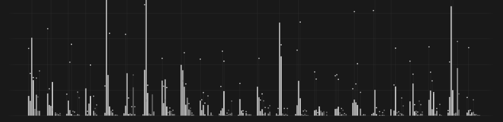
I recently came across some energy consumption data for the UK since 1970 and came up with an alternative method of display. The light grey bars are used to show the total energy consumption, and a breakdown of either the fuel type or sector are shown within. Crucially though all elements for comparison are shown along the same baseline which hopefully makes trends easier to follow.

Click here to enlarge

I did consider applying notes to this chart to highlight historical events that may have influenced the data, Thatchers election as prime minister in 1979 or the coal miners strike in 1984 for example. I don’t feel that my role is to provide all the answers though, just the facts in a digestible manner. I hope though that the well informed reader will make these connections themselves and as such will feel rewarded by their intelligence.


To see this and more of my work visit my website by clicking here: 


Update 1
Comments below make reference to the following images,
Image 1. Chris Twigg

Image 2. Ben Willers


Update 2
To read more about this visualisation click >here to visit The Guardian Datablog.


Tuesday, 27 March 2012

You are all explorers now

I observe many infographics which serve no real purpose other than to convey a simple statistic that could quite easily be expressed in just a few simple words. These visuals are the bullet points in our field, spoon-feeding the reader with snippets of information that they are forced to accept at face value. While it is true that they serve a purpose as far as attracting attention, they do nothing to encourage exploration or allow the reader to contemplate deeply about the subject. I don’t have a problem with this practice as such, however it is important to carefully consider the needs of the audience and I see these types of visuals being used far more frequently than I think is useful. It would be easy to point fingers at the designer at this point, citing a lack of effort or understanding of the subject. The culprit though can probably be traced back to poor data selection from the outset. No matter how talented an individual is in bringing data to life, if that data is merely just a few predetermined percentages extracted from a paragraph of text there is little that can be done. On many occasions those asked to visualise this data would not be permitted to introduce new information of their own, possibly through fear that the visual will tell a different story from what the client intended. Designers are asked to mold this data in a similar fashion to an artist molds clay, except you wouldn’t provide an artist with poor quality clay from the Early Learning Center and expect a masterpiece.

Having worked within the journalism field for a few moths now I know of these frustrations first hand. I feel incredibly lucky though that I am given a reasonable amount of freedom to research around the stories we cover and introduce new data which I feel is worth exploring. Until now I have always created charts for articles that were being written, however my latest piece is from a dataset I stumbled across and though would be worth exploring regardless of its relevance to any particular current event. It examines 24 countries in Europe and their commitment to renewable energy. This is not designed to answer a predefined question or tell a story in a particular way. This lack of initial guidance therefore requires a certain amount of effort on the readers part, however the freedom this approach offers much appeal to myself and highlights the real potential of information design.

Click here for larger version — iPad users click here

Once again I have used per capita figures because I believe that this is the fairest way to compare countries of various sizes. More specifically I have used population figures of those of working age to show what percentage of the total workforce is employed in renewables. Likewise I have shown the amount of turnover from these sectors as a percentage of each countries GDP. I’m not going to offer any further explanation, I hope you will take a little time to scrutinise over it yourselves and make your own discoveries. As ever I would really appreciate any feedback on this as I hope to push this type of work in the future.

The article that was written to accompany this graphic can be seen >here

Saturday, 24 March 2012

Beware of the bubbles


This morning I came across this >article

I find it difficult to believe that an organisation so intrinsically linked with data as Nelsen can fall into one of the biggest visualisation traps around. Their site states, “We believe providing our clients a precise understanding of the consumer is the key to making the right decisions.” I seriously doubt any reader of the following diagram will receive an accurate impression.


Take a moment to compare some of the numbers shown with the circles presented. Do you get the impression that for TV Shows the blue circle is 4 times the size of the orange one? It’s unlikely, because the designer in this case has scaled the circles using their diameter values. There is no escaping the fact that the brain will naturally try to compare their areas, thus it is necessary to take square roots of the data beforehand. Some alternatives to the Downloaded Music part are shown below.


In fact the area method is far from perfect, notice how difficult it is to compare values of 19 and 20? Had the percentages not been shown we may have assumed they were identical. The bar method is far superior for communicating quantities precisely. Chapter 1 of my dissertation from last year examines this in greater detail.

Dissertation >here

Nelsen are currently running a data visualisation competition, unfortunately only residents of the United States are permitted to enter. Nonetheless I await the results with bated breath.

Wednesday, 21 March 2012

Teacher for the day

I was recently asked if I could return to the University of Lincoln for a day to speak to the second year Graphic Design group who are currently in the middle of there own data visualisation projects. They have already covered many of the principles of graph design and are now at a stage where many are keen to increase the aesthetic appeal of their work. There were 80 or so students split across morning and afternoon sessions. After a group review of their practical work from the previous week I talked about some of the work I produced on the MA program, competitions entered since then and some of the stuff I am currently producing for Blue & Green. I also talked them through my development process and shared some of my thoughts on balancing form and function. By far my favorite part of the day was when after finishing both of the sessions small groups of really keen individuals came to ask questions, discuss problems they were having and take a look at the MA log books which I had brought in. Reading the blog of Katie Ulett later that night really made my day.

View >here

The groups task is now to use provided dataset on energy consumption to produce an A1 data visualisation poster. I must admit I am very keen to give it a go myself, I haven't seen the spreadsheets yet but hopefully I can make it relevant to my work for Blue & Green. I saw some promising work today, hopefully I will get an opportunity to see some of the final outcomes.


Thursday, 1 March 2012

Beauty, in the eye of the beholder


Information is Beautiful have tonight announced the winners for their latest design challenge. Once again I was lucky enough to have my entry featured in the shortlist, however hopes of a second win were later dashed. The winning design would not have been my personal pick, and the early reaction on twitter that I have observed suggests others share a similar view. So I thought it would be interesting to look a little deeper at some of the other entries and discuss my favourites.

See the winners >here
Shortlist >here


Hollywood Budgets by Barinov Tëma replicates the visual style of McCandless’s Billion Pound-O-Gram, even down to the rounded off corners which I suspect are applied after the data has been encoded, unless they have devised a rather clever formula to do this. I found the information within genuinely interesting though as I often have little knowledge of what studio is responsible for which movies and I appreciate the split down view to allow comparisons to be made between years. These treemaps though make the data even more difficult for the brain to decode than pie charts since the segments are not only scattered around the page in a state of disarray, they are often of completely different shape, and if the figures were not given we would be forced to make wild estimations based on area alone, often a recipe for disaster. Despite all this I got a reasonable amount of enjoyment exploring this visual and feel the information obtained has made a lasting impression.


Spotlight of Profitability by Krisztina Scuzzies compares Rotten Tomatoes scores against budget and worldwide gross. This was a something I experimented with showing in my own design and I found some interesting patterns. The crucial question the reader will probably want answers to is, “Does a critics score influence box office performance?” This visualisation certainly doesn’t make answers to such questions easy and its a pity that more movies could not be compared directly without appearing cluttered, however I found myself getting more enjoyment and information out of it as I put more effort in. The sharp clean visual style and colours used appeal to me greatly and on an aesthetic level alone this is easily my favorite.

Congratulations to all that got shortlisted. As ever I look forward to seeing what designs emerge from the next challenge.

Tuesday, 21 February 2012

Hollywood Loves Pies


I recently received a tweet of support for my recent Information is Beautiful competition entry from Saakshita Prabhakar. She later asked if I could provide some feedback on the Visual.ly site for the piece she submitted. These were my impressions:

Comparison of pie chart segments can be extremely difficult since it can be challenging to measure angles or arc lengths with our eyes alone, especially when we are required to make comparisons between many diagrams distributed around a page. I like how in this image many of these problems have been eliminated. Firstly each segment begins at the standard 12 o’clock position which instantly makes things much easier as we are not required to use our brains to rotate them ourselves. By highlighting the 10% intervals we are also provided with a series of perceptual anchor points which our eyes make great use of when making quick comparisons between different areas of the page. We are also able to count these bars and accurately decipher the corresponding percentage if that is our intention, a task which would be almost impossible using standard pie charts.

The clean, uncluttered style makes it a joy to read, even the legend at the bottom looks lovely. It would work great as an interactive piece where the reader could expand each section to see which other movies came out in that period.

I wonder if it would have been possible to somehow also show total box office takings as well as a percentage of the total for that year? I say this because it appears on this diagram that Kung Fu Panda 2 did better than Toy Story 3, however this is not the case. Dreamwork's picture only did better in relation to everything else from that particular year.

My preference would have been to arrange the years progressing from left to right since that is how I preattentively expected them to appear, but its really not a big issue and they are labeled clearly enough.


Very nice work, I look forward to seeing what you produce for the next one!