Information is Beautiful recently closed a challenge to visualise data from 50 years of James Bond movies. As ever I found the topic and data they provided really interesting so I could not resist giving it a go. Saakshita Prabhakar has already blogged about her entry so I thought I would do something similar and run through some of my decision processes.
Some of my recent projects have involved some quite large datasets, so initially it came as somewhat a relief to have something considerably smaller for once. When working in this way the data must be really focussed to answer the key questions. For me the compelling question I really wanted an answer to was ‘Which actor made the best James Bond?’
Much of the data provided appeared irrelevant to answering this question, number of Martinis drunk per movies didn’t hold my interest for long, although it was quite interesting to see Brosnan's movies contained a lot more killing and less kissing than the others. I eventually decided to narrow it right down to two really key bits of information, critics scores and box office revenue adjusted for inflation.


Without going into too much detail I experimented with a few ways to display these two sets of data. Ordering the movies along a common baseline seemed like the way to go to make comparisons easy, but this did not make for a very interesting looking visual. I wanted to incorporate a Bond theme into the visual style using predominately black, white and red, however this became impossible once I decided to represent each actor using colours. The final piece contains none of the theming elements I once hoped a James Bond piece would, and that for me is somewhat regrettable, however communicating the data is always my primary intention. I look forward to seeing other people’s approaches to the task.
 |
| Click here to enlarge |
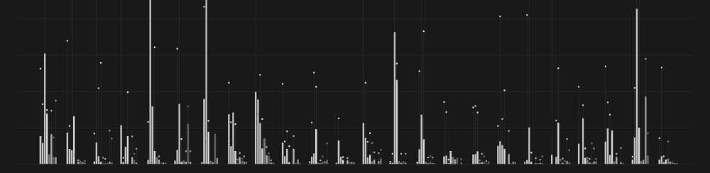
So what does the final piece tell us? Firstly it appears I am really out of touch with the critics, I grew up in the GoldenEye era and prefer the Brosnan movies over the others I have seen. These films however are considered some of the worst, but more surprisingly I discovered that Rodger Moore has an even lower average critic rating and dominates the bottom of the chart. Timothy Dalton, whose films were reviewed quite well, suffered badly at the box office. The undisputed master at playing Bond is Sean Connery who features heavily at the top in both cases. Daniel Craig is the second most sucessful Bond financially and has varied in quality according to the critics. It will be interesting to see how the response to the upcoming Skyfall this October will affect his legacy.
Took me a while to get the hang of it but I came around. Its a great effort! While the 'rotten tomatoes' section on the left is pretty clear, what I am a little unclear about is the worldwide revenue adjusted for inflation. How did you derive these values and what is the common baseline for these values. Have you predicted what the amount would correspond to in today's date? do let me know. Its a great additional layer to add though. All the best and thank you for the mention :)
ReplyDeleteThanks that’s great to hear and really useful. The inflation adjusted figures were provided in the data by Information is Beautiful and have come from The Bureau of Labor Statistics. Each movie has had it’s box office revenue converted to the equivalent amount in 2012 so we can compare old with new. Both the actual amount and inflation adjusted figures are shown in my piece, although I think I should have made it clearer. The thicker white lines represent actual takings and the thinner grey ones show the inflation adjusted equivalent so that you can compare both on the same chart using the same scale.
ReplyDeleteI am continuously trying to leave off anything which I find irrelevant to the diagram, thus I risk leaving off elements which may initially aid the reader. Hopefully I leave enough clues in there, but I am quite keen to make the viewer work a little harder than some infographics do because I really feel this makes the reading experience more interesting and pleasurable. I like to provide a series of hints and let the reader draw their own conclusions. I haven’t attempted to rank the bonds (although that would easily be possible by employing a scoring system for the two criteria used), hopefully the reader can use their own judgment for that.
Anyway I’m rambling, to summarise I am conscious I could potentially leave off too much vital data and hearing about how you initially read the piece really helps me decide what I can afford to exclude next time around.